The Lay of the Land
 (c) tsibley, used with kind permission
I have a lot of questions. I blame the fact that I grew up in a fjord.
Our town was squeezed onto a small strip of land on the edge of a deep bay, in an oblong bowl of mountains. To get anywhere, you had to leave by either “the narrows” on one end, or “the pass” on the other. Once outside, the closest approximation of civilization was eight hours away.
Inside this pre-Internet Shangri-La, raised with old comics instead of television, I developed a concept of the outside world which required a lot of recalibrating later. My education at the hands of my cartoon masters was supplemented by months-long summer family road trips, most of which were spent creeping through interminable mountain ranges, as I studied our road atlas, and my comics.
Eventually I escaped my fjord, but a few lessons of my youth have been repeatedly confirmed: topography is important, and there’s no faster way to make an impression than with a cartoon. And by “cartoon” I mean a simplification which exaggerates some details and omits others. You could also say “model,” but I like the connotations of “cartoon”; it retains a transgressive frisson that the word “model” doesn’t have, unless you’re in fashion. But anyway.
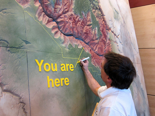
Some of my favorite things combine topography and cartoons. One in particular holds a special place in my heart: the raised relief map.
I love these maps because they feel like a very simple way of approaching some very complex questions which I don’t think anyone has answered to my satisfaction:
Where are we? What is this place like? What does it mean to be here?
Lately I’ve been focusing on a small part of this question set, something I’ve never felt I thoroughly understood: How big are mountains?
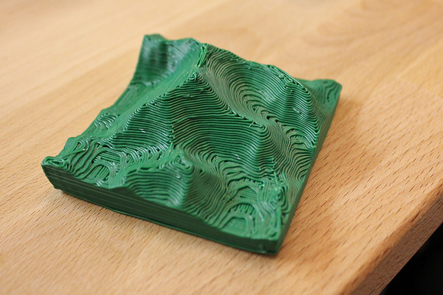
Most attempts to get a feel for large-scale topography, including many relief maps, involve scale models. Here are two scale models of Everest:
Both involve an attempt to reduce the landscape to a scale directly appreciable to humans, but they don’t say anything about the mountain’s context. Normally, to do this you have to go bigger. Here’s the South Rim Visitor’s Center at the Grand Canyon:
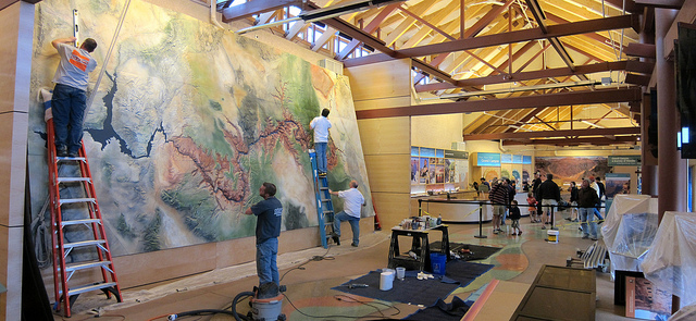
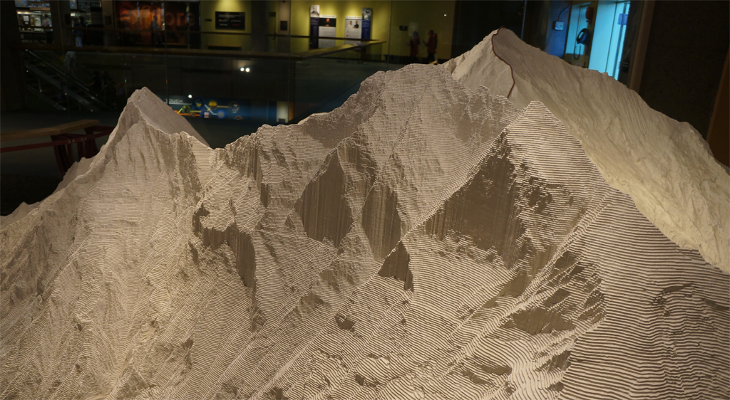
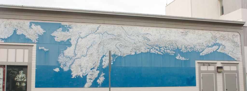
This one takes up the side of a building in Anchorage – it’s worth checking out the large version, where you can really see the texture:
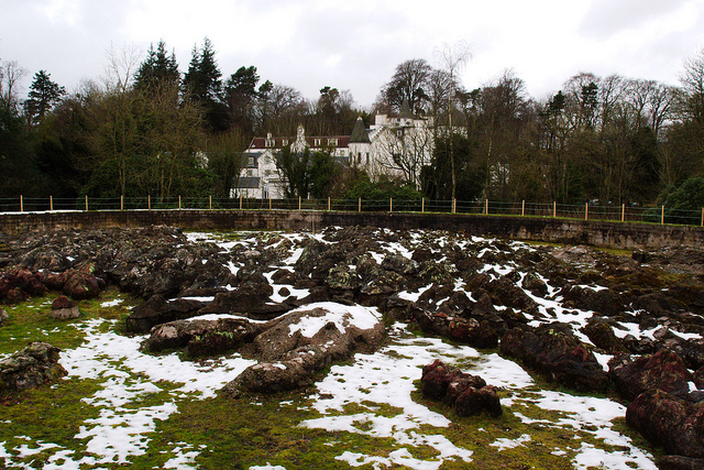
The outdoor, all-concrete Great Polish Map of Scotland claims the title of largest relief map, and is pretty great:
Though this .9-km Chinese replica of disputed territory between India and China would be larger by far, if it was in the running.
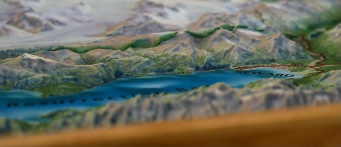
But my favorite of all is the Challenger Relief Map, depicting the entirety of British Columbia, built on 196 plywood panels, now sadly split up. Here are eight of them:
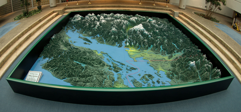
A closeup:
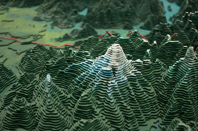
Those are hand-cut plywood pieces. There are nearly a million of them. The original map was for many years on display in Vancouver. I can’t tell whether my dim memory of seeing it is genuine, or just empathy for a familiar landscape. Here’s an old photo of the whole thing, with bankers for scale:
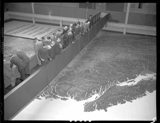 Bank of Commerce directors viewing the Challenger map in the PNE BC building, 1954. Source: A. Jones, Vancouver Public Library
The map is an incredible feat, but it’s also an interesting set of decisions.
I want to go back to that 3D-printed Everest for a second. Though I believe it to be a true-scale representation, it’s also a simplification, by virtue of its construction. It’s rendered in a single color, stripped of environmental factors and all other depth cues. And like the Challenger map, it features layering artifacts, which serve as a kind of low-pass filter; it can’t show vertical details smaller than one layer tall, or horizontal details smaller than the radius of the extruded plastic in the former case, and the blade of George Challenger’s fretsaw in the latter. So rather than being purely mimetic, these models are also cartoons, in the Raphael and da Vinci sense: an outline, or compression, of a more complex idea.
Whether due to limits of the material, the analytic or artistic judgments of the creator, or other artifacts of the process, most relief maps involve this kind of explicitly interpretive reduction. This increases their usefulness – an exact miniature of the landscape would not necessarily be more informative.
I’d love to explore a map of the world in such a style. But these things are incredibly time-consuming, requiring a lot of labor and decision-making, and eventually you run out of space. I’ve spent a lot of time working with 3D graphics, so here my thoughts naturally turn to a sub-question: Could these kinds of decisions be made programmatically in any way? And can our experience of mountains be incorporated at all into the process?
Which raises one further question: What is our experience of mountains?
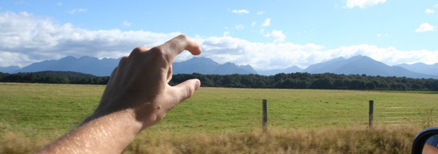
On average, when a human sees a mountain, it’s from a distance. Likewise, when seen from an airplane or satellite, mountain ranges are squashed to a small scale. And perhaps because we mostly live in and interact with relatively flat landscapes, we seem predisposed to give greater importance to topographical differences in flat areas; depending on how many gears your bicycle has, a slight incline can seem very steep indeed.
And a funny thing happens when you approach a mountain – it grows until you reach the foothills, and then as you climb, it shrinks again. Then, when you’re right on top of it, it disappears. Sometimes very sharp changes in elevation hit a kind of sweet spot in our ability to appreciate vastness, and there vertigo kicks in. But most of the time, mountains are too big to understand.
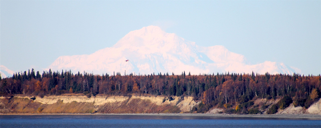
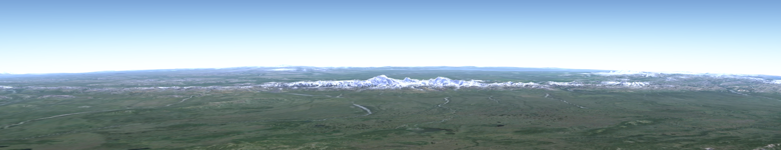
Certain mountains are much higher than their surroundings, and thus appear much, much larger than others; these encroach on that vertiginous sweet spot. Denali, especially when approached from the north, appears to be alone in a great plain. Here it is from 130 miles away:
But take away the depth cues – atmospheric perspective, texture, and snow coverage – and one mountain looks much the same as another. Can we understand mountains without these details? Or could these details be incorporated or transformed into some other kind of understanding? A topographical depiction ought to relate to our subjective experience of topography, particularly our ability to grasp differences in scale. Which kinds of differences matter?
All this to say: We have our limits. Can we fit a mountain range into them?
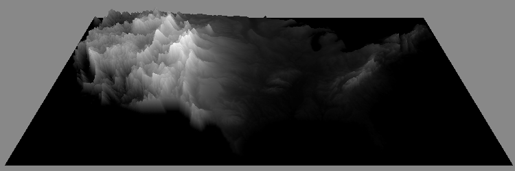
To a satellite’s radar eyes, mountains look like this:
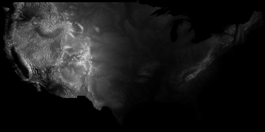
This is a “heightmap” of the contiguous 48 United States. In this image, higher elevations, as scanned by a satellite, are represented as brighter pixels.
With a 3D model, we can reverse this scanning process, representing brighter pixels as higher elevations. This is how Google Earth’s 3D topography is created. But at true-scale, at this size, the area depicted by the heightmap would still look two-dimensional. Compared to its breadth, the Earth’s surface is flat: smoother than a billiard ball, the Himalayas a fingerprint.
Here’s Denali again, as seen by Google Earth at true scale, zoomed in far enough that its height is apparent, the curvature of the Earth only just visible:
If we want a clearer view, we can exaggerate the elevation, while leaving distance alone. Here’s a factor of 3, which is the most Google Earth allows:
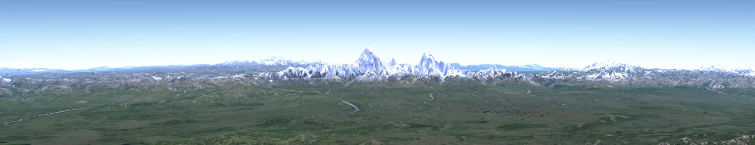
Denali is properly shown as weirdly massive, as though it had been dropped from space. But when applied to our heightmap, at a continental scale, even a 3x exaggeration is invisible:

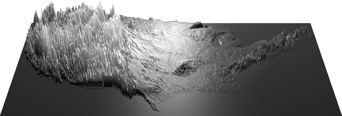
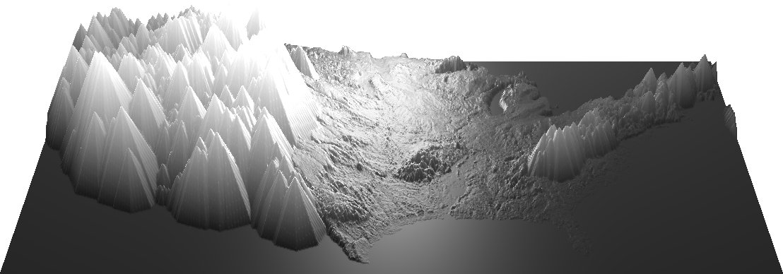
In this image, the US is at a graspable scale. But we don’t live on that scale, and neither does topography. How can we translate the language of mountains?
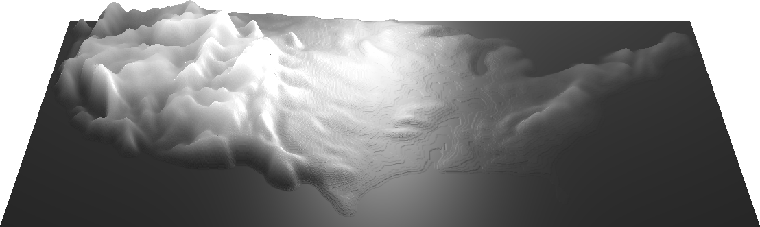
Here’s an image showing approximately a 10x elevation exaggeration, with lighting applied to brighten the scene a bit:

The mountains are now more recognizable, and subjectively appropriately tall, but the lowlands are still unnaturally flat-looking; here, they look flatter than they feel.
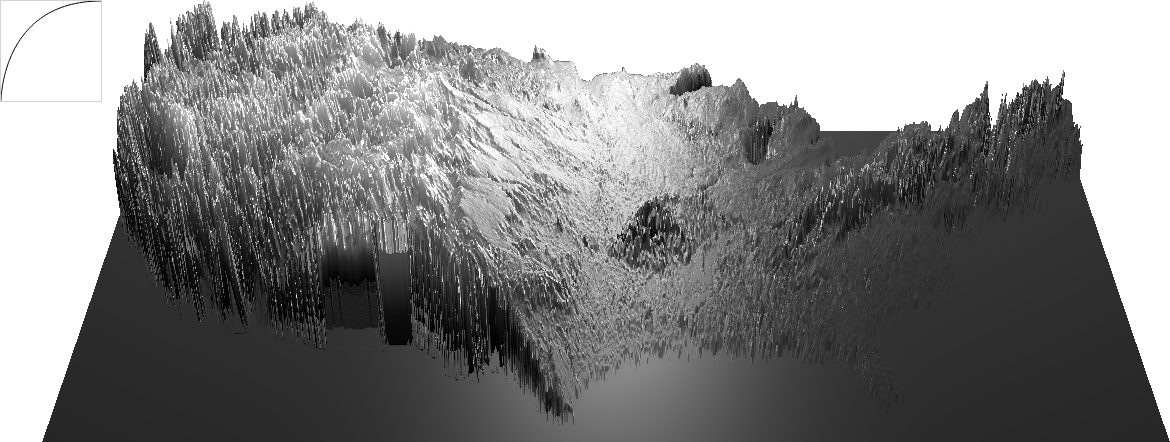
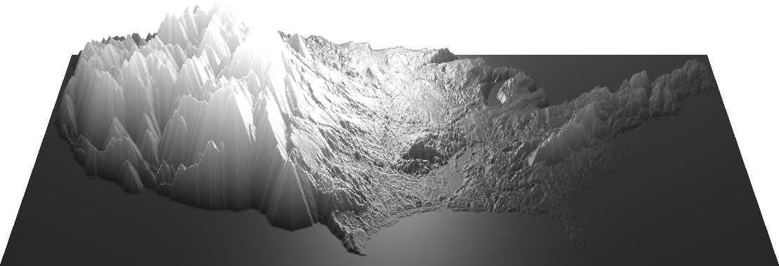
Here’s a scaling factor of about 150:
Now the lowlands have some texture – look at the gradual slope of the plains! – but the mountains are lost in high-frequency spikiness. They’re too noisy to read.
(Try this yourself with this scaling demo – it’s made with a newish feature called WebGL, which isn’t supported by all browsers yet. You can check your browser’s compatibility here.)
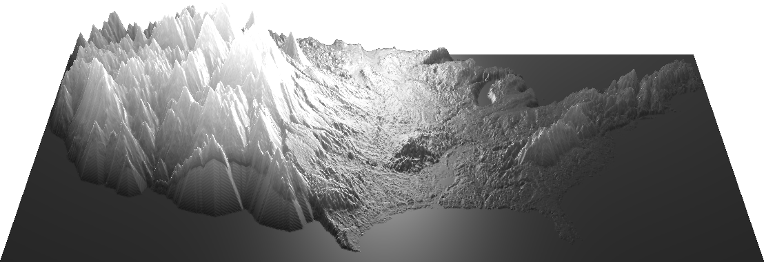
So far, we’ve been seeing linear mappings of pixel values to height values, meaning that the brightness of the image correlates directly with elevation. How about an exponential mapping, weighted toward higher or lower values? This would let us compress or expand certain parts of the model separately.
Here’s a “knee” curve, which exaggerates lowlands and squishes higher elevations flat:
And a “bézier” S-curve, compressing the middle values and exaggerating both the lowlands and peaks:
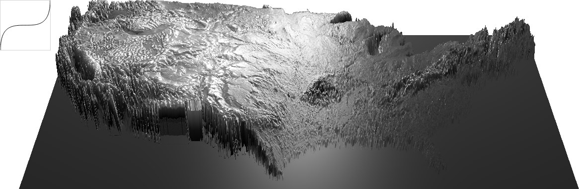
Some of the values here work pretty well, but only for some regions. When the Great Plains look good, the Rockies are distorted, and California never makes any sense.
So it seems that when appraising mountains, to some extent steepness and relative height is more important than absolute altitude. This makes intuitive sense to me – the hill I’m climbing may not be the tallest in the world, but my legs don’t care.
(Try the bézier interpolation demo.)
What do we want from this kind of view, anyhow? What questions are we asking when we look at it? I have two to suggest:
-
How does the information relate to its local context?
-
How does it relate to the whole?
In the case of our elevation data, this translates to:
-
How does a given feature relate to neighboring prominent or important features? and
-
How does it relate on the grand scale? Is it higher, lower, smoother, or peakier than average? How does it relate to the topographical extremes? Is it the most anything?
What kind of information would give us this knowledge? How could that information be represented? What are the constraints?
In our exaggerated elevation map, the scaled-up peaks no longer look like peaks. In both a mathematical and practical sense, their slopes are too steep. (Mountains that look anything like this are extremely unusual: the Trango Towers in Pakistan are unbelievable.) So there’s something here about our ability to cope with both scale and dynamic variation. It seems we can only appreciate a certain range of differences in a given context.
The easy way to smooth things out would be to blur the heightmap, or to lower the resolution of either the image or the number of points in the base 3D geometry, which amounts to the same thing, though the artifacts manifest differently:
But here we lose details in areas that don’t need blurring. These processes are indiscriminate, and context-free. Ideally, we’d be able to affect only the slopes over a certain steepness.
There are lots of ways we could do this: we could use the old “find edges” command to produce a “slopemap”, in which areas of steeper slope are represented by brighter pixels – it’s the equivalent of the first derivative of the heightmap. But I want to look at a couple of slightly sharper tools.
There are two ways of desteepening a slope: we can lower the peaks or raise the surrounding areas. The image-processing equivalents of these operations, when applied to grayscale images such as our heightmap, are called “erode” and “dilate”. Though these terms suggest specific physical processes, they’re really describing specific transformations applied to black-and-white images. A special case of each process can be applied to grayscale images, which happens to correlate somewhat to its effect on our terrain.
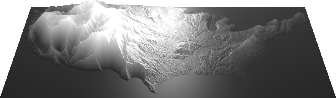
So let’s take a look at an “erode.” It might be more accurate to describe this as a “relax” – similar to the way that wet sand can pile at a steeper slope than dry sand, an “erode” changes the terrain’s limit of pile-ability. Here are our peaks being eroded, collapsing into each other as sharp differences are smoothed:
(Try the erosion demo. Fun fact: if you turn the erosion threshold down to 0, you get a “distance map” in which brightness represents each pixel’s distance to the nearest edge!)
And here are the lowlands around peaks being “dilated”, the mountains swelling like barnacles as the valleys between them are filled:
And here’s a combination of the two:
I’m a fan of this last combination – the peakiness of the tallest peaks is well-preserved, while lesser peaks are sacrificed to reinforce the prominence of their larger neighbors. Simultaneously, smaller details are magnified in areas with less variance in elevation – the character of the lowlands is enhanced.
The beauty of these processes is that they only apply to steeply sloping areas, leaving flatter areas untouched. But by their nature they tend to remove the subtleties from the areas they affect. If we’d like to restore some of those subtleties, we can fade the original heightmap back in on top of the edited version:
(Try the combination demo with overlay – this one is a bit of a beast, and may run very slowly.)
These images represent the results of specific combinations of mathematical and geometrical processes, but don’t let the math fool you: the choices I’ve made here are largely aesthetic. In particular, they have been “tuned” for this continental view; the same settings wouldn’t work as well from further out or closer in, though a different combination of settings could. In fact, for my last trick, I’ll tie the values controlling erosion to the distance from the camera to the model, so that the size on the screen of the largest mountain stays relatively steady as you approach it:
This last step is particularly interesting to me right now, as it adds a variable dimension you can’t easily get in a physical model. I’m thinking of this proof of concept as an adaptive summary of the heightmap – a kind of expressionist visualization, in an attempt to make this information “medium-sized”. And I have to reiterate: as these images are the result of a stack of fairly esoteric manipulations, they’re no longer particularly empirically useful (whatever that means) – they’re just a first step in this direction.
This kind of dynamic representation might look odd here, but we do this sort of thing constantly, especially in the digital world. Online maps show various details – like roads, or street names – only at certain zoom levels. The act of resampling a digital image averages or extrapolates the value of a pixel from its neighbors. And every pixel in every digital photograph is the average of the light that reached that spot on the sensor.
I’ve cheated a bit here by focusing on relief maps. Every representation, in every medium, is subject to procedural artifacts and the judgments of its creators. Some artifacts are more obvious, and some judgments less expressly intentional, but all of our attempts to process and describe our surroundings must contend with these forces.
This fact echoes life in a body made of sensors, all wired to a brain – our experience is the sum of heavily-processed and filtered inputs. There are no guarantees of absolutes in the information we are exploring, and every sensor is a filter. And the more we learn about physics, the more we understand that we are afloat in a sea of statistical likelihoods, and that our ability to group sensations into a world of coherent, individual objects is a very free interpretation of the available data.
So it makes sense that we gravitate toward models. Unless you believe you have direct access to the world of pure being, models are all we’ve got. I’d like to get better at working within these constraints, and in understanding and manipulating them to our advantage.
There’s been an upswell of interest in data and its analysis in the last few years, especially by people like myself with little to no formal training, as tools simplify and access gets easier. Data is spilling over the walls of science and business and into the humanities, and journalism, and civics. I think those of us so engaged are abandoning our reliance on voices of authority, and taking up these tools ourselves, and I think that’s good, and important. But at the moment, we seem to be grasping for absolutes, as though part of an empiricist cargo-cult ritual; we crave a number, any number, even if we don’t understand it, so long as it looks precise. And because we have access to very precise-looking data, we feel obliged to represent it precisely.
This obsession with nominal accuracy, and its conflation with realism, completely misses so many interesting ways to comprehend and explore more complex ideas – maybe even in simpler forms, and maybe even more truthfully. I’d like to see what happens if we allow the data to fit to a human scale, while being open and honest about where it comes from, and what happens to it along the way.
(All the demos above are collected at https://github.com/meetar/heightmap-demos.)