Case Studies
Most of my work in the last ten years has been focused on rapid prototyping using off-the-shelf web technologies in new or unusual configurations, to explore potential product landscapes.
I’ve worked with product, engineering, research, and design teams to solve interesting problems across a wide array of industries, most recently in digital cartography and internet security. My work as a prototyper, developer, and product designer is especially influenced by my background in animation and visual effects.
Here are some examples to illustrate that work, as well as the guiding principles which inform it: 1) the connections between design and engineering, 2) visual explanations, and 3) exploration as a tool for learning.
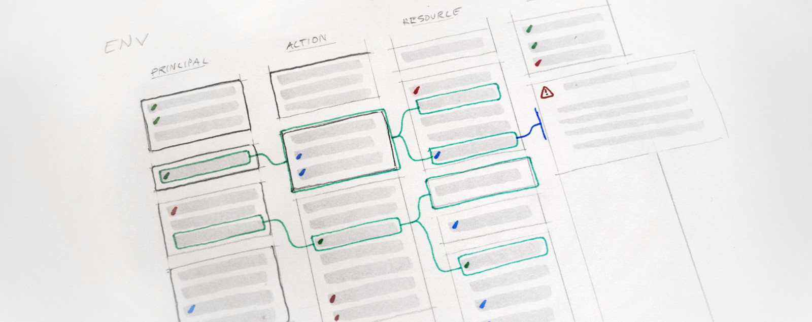
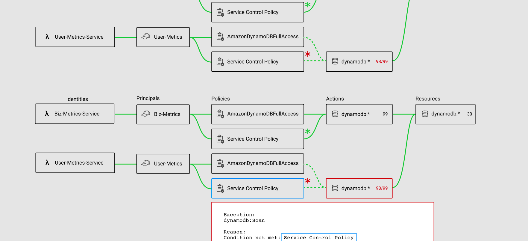
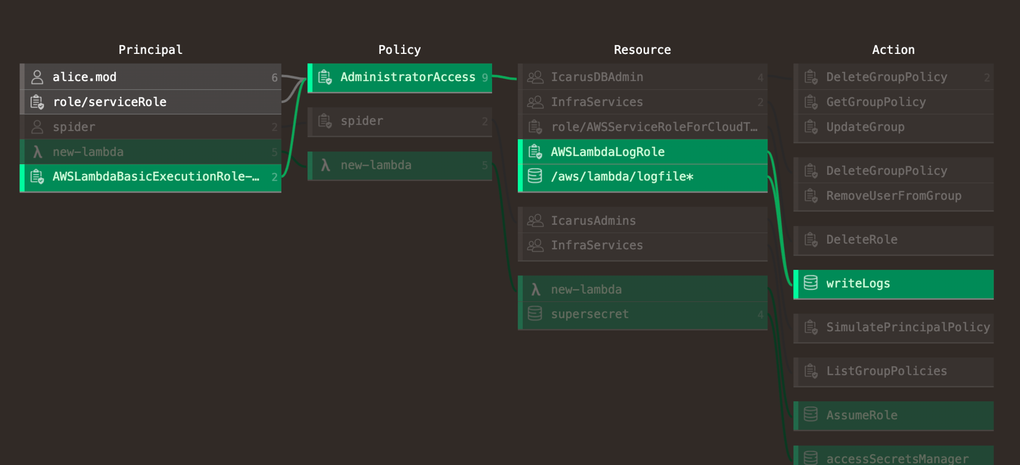
This project was a key component in a network administration product I worked on as principal product designer for a startup inside a large security organization. User research by the product team found that security administrators were unsure what effects a given change to their permissions configuration would produce. Because of the interlocking, overlapping nature of these networks, apparently-simple changes could have extremely wide-ranging, unexpected, and costly effects.
The engineering team found a method of simulating these changes, but communicating the results proved challenging in complex network environments. Thousands of overlapping group relationships produced very large and unwieldy visual structures when graphed with standard network visualizations, and as the data contained entirely categorical rather than quantitative relationships, no natural non-arbitrary sorting or ranking was possible.
The results dataset was the key value proposition of the product, but it was difficult to understand. Could it be tamed?
 Figma Mockup
 Prototype Interface
This interface allowed security administrators to explore access configuration changes step-by-step, by building paths through the complex network of interrelationships. Filtering and search mechanisms permitted the real-time expansion, contraction, filtering, and restructuring of the graph.
The result is a visual representation of many consecutive queries, each building on the last, mapping the ways that access changes propagate through the downstream network. The results can be both summarized and detailed in targeted ways, according to the specific needs of the user, while only showing as much or as little detail required by a given use case.
The prototype was a standalone tool which simulated database queries client-side. Later versions were integrated into a React app, making graphDB queries through a custom API developed by the engineering team.
Technology used:
- React
- JQuery
- SVG
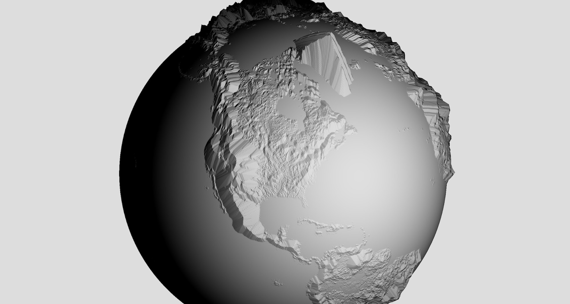
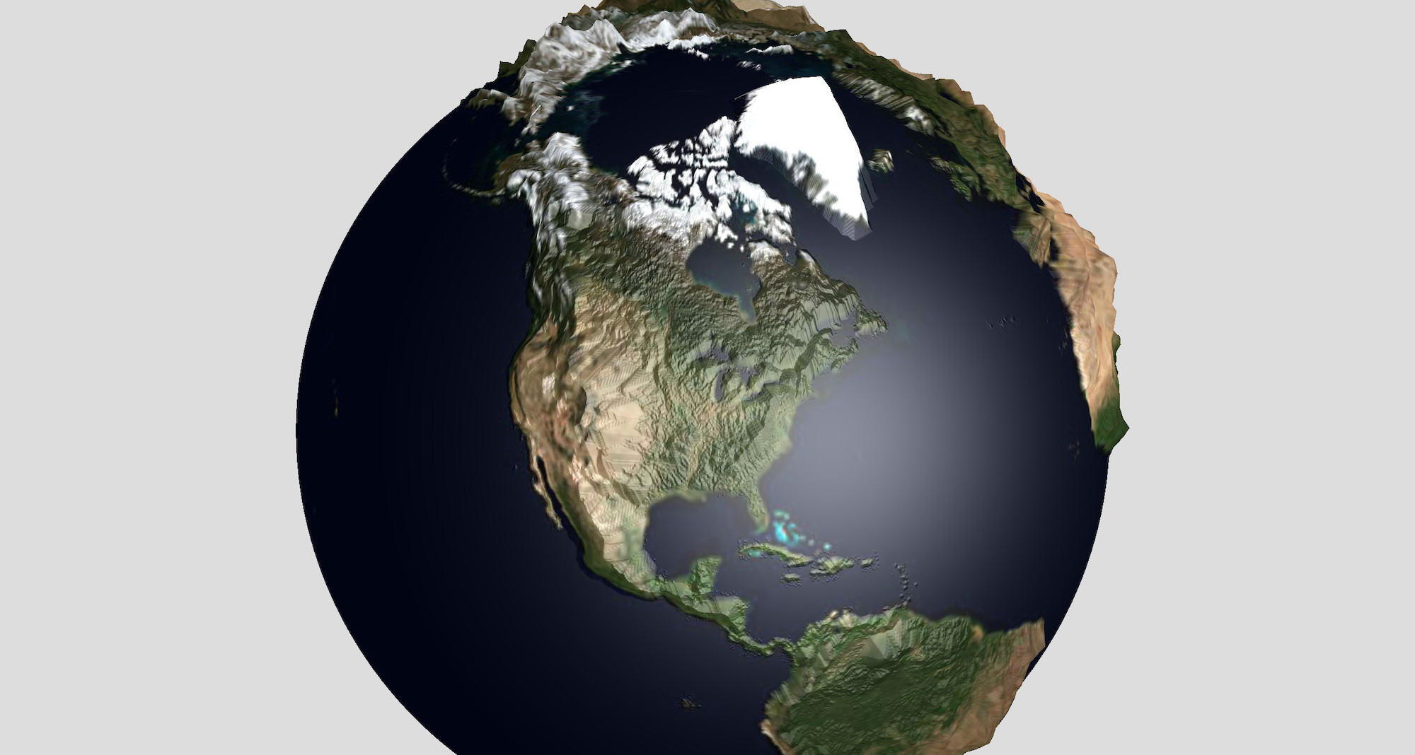
In visual effects work, it’s common to want to zoom into or away from a depiction of the Earth. In these cases, topographical features are typically only represented at a single scale, if at all – either they are a cartoon version of terrain or real-scale. Actual topographical data becomes difficult to exaggerate at large scales due to a mismatch between the scale of the map and our experience of mountains – when mountains are scaled vertically, things don’t look right. Can our expectations about how landscapes should look be described empirically so computers can get involved?
This was a project I initiated to test the capabilities of a relatively-new web graphics library called three.js, which has since become one of the standard technologies of online 3D. It was also a chance to scratch a few technical and aesthetic itches, while bringing some techniques from graphics programming to the web.
Can this unwieldy data be used to show something new?
 Lighting Layer
 Color Layer
This browser-based terrain-drawing tool uses adaptive generalization to make an exaggerated terrain map of the Earth, similar to a plastic vacuformed raised-relief map. However, this map responds to zoom level to keep the size of the tallest mountains relatively constant, while combining neighboring features as necessary to simplify terrain. These transformations can be animated, and the results exported for use in other 3D applications such as Maya or Unity.
The effect is of a planet which shows more detail as you approach it. This was the demo which led to my position as the first graphics hire at an open-source GIS startup.
Technology used:
- WebGL – a JavaScript API for controlling graphics cards
- a fork of the three.js graphics library with custom shaders
- SRTM global heightmap data
While at the R&D center of a large GIS organization, I was part of the development and launch of a design and component system for a major product offering in widespread use by governments at all levels as a public-facing communications platform. Part of that initiative was focused on increasing accessibility while expanding the capabilities of the component system, not least to ensure compliance with federal regulation.
The average digital map is an inherently visual object, with text embedded as pixels in the images which make up the map. This means any data embedded in maps is completely opaque to screen readers, and to reach these users, the data must be offered in other form factors.
Are there ways to use the strengths of a map to reach people who don’t use them in the typical way?
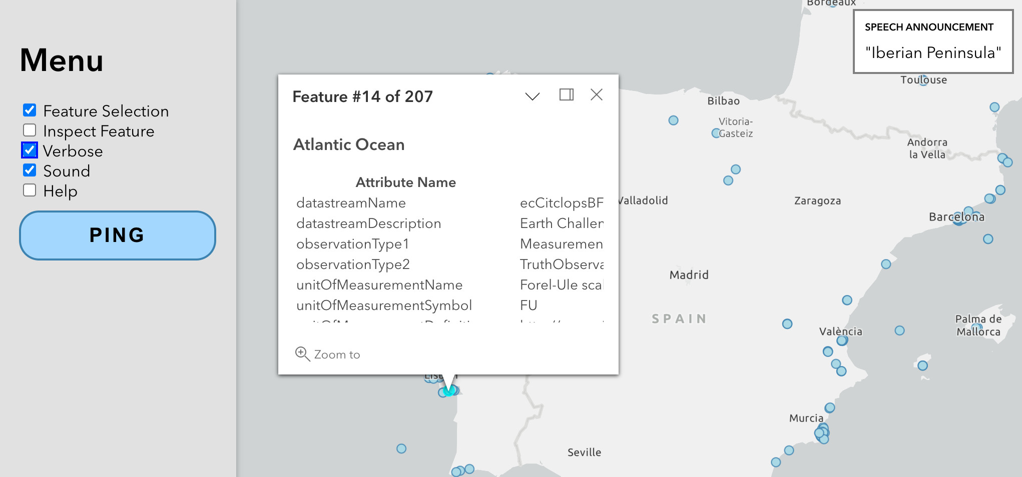
This map prototype was made to demonstrate the flexibility of the design system, and was made by integrating third-party libraries into the design system components. It is explicitly designed for screen readers as its first audience, and features a musical interface which treats latitude as pitch and longitude as time.
“Playing” all the data in the region of interest gives a musical overview, and stepping through the notes individually allows datapoint-level introspection. Map labels are presented as HTML elements rather than embedded in the map tiles, which grants screenreaders access to the information. With a keyboard interface, a geolocation API, and careful use of ARIA tags, a text-to-speech interface announces general and specific locations as the map position, and variable amounts of reverb serve as a secondary clue to zoom level.
Technology used:
- ESRI ArcGis Hub cloud platform
- Calcite – ESRI's internal component design system
- d3.js browser-based data-visualization library
- Tone.js Web Audio framework
While working on the development of Mapzen’s graphics library, the graphics team worked to bring modern graphics techniques to online mapping. One of the major challenges was in overcoming expectations about the limitations of existing toolsets, and demonstrating potential benefits compared to traditional workflows.
For example, topographical map data is normally quite difficult to obtain, work with, and style. In most cases, if it is offered as part of a GIS product, it comes as a pre-set layer with limited customization options. This is in part because the traditional methods of working with this data are based on old conceptual models, both cartographic and technical.
Terrain data is typically presented as a pre-processed, pre-rendered static image layer. During processing, the standard methods of converting terrain data to images involve creating virtual light sources and manipulating them until the desired traditional effect is achieved, which requires a relatively sophisticated understanding of the conceptual models involved, and the appropriate goals of both terrain styling and 3D lighting generally.
Is there a way to make this work less arcane and technical, and more broadly accessible?
 Mt. Fuji
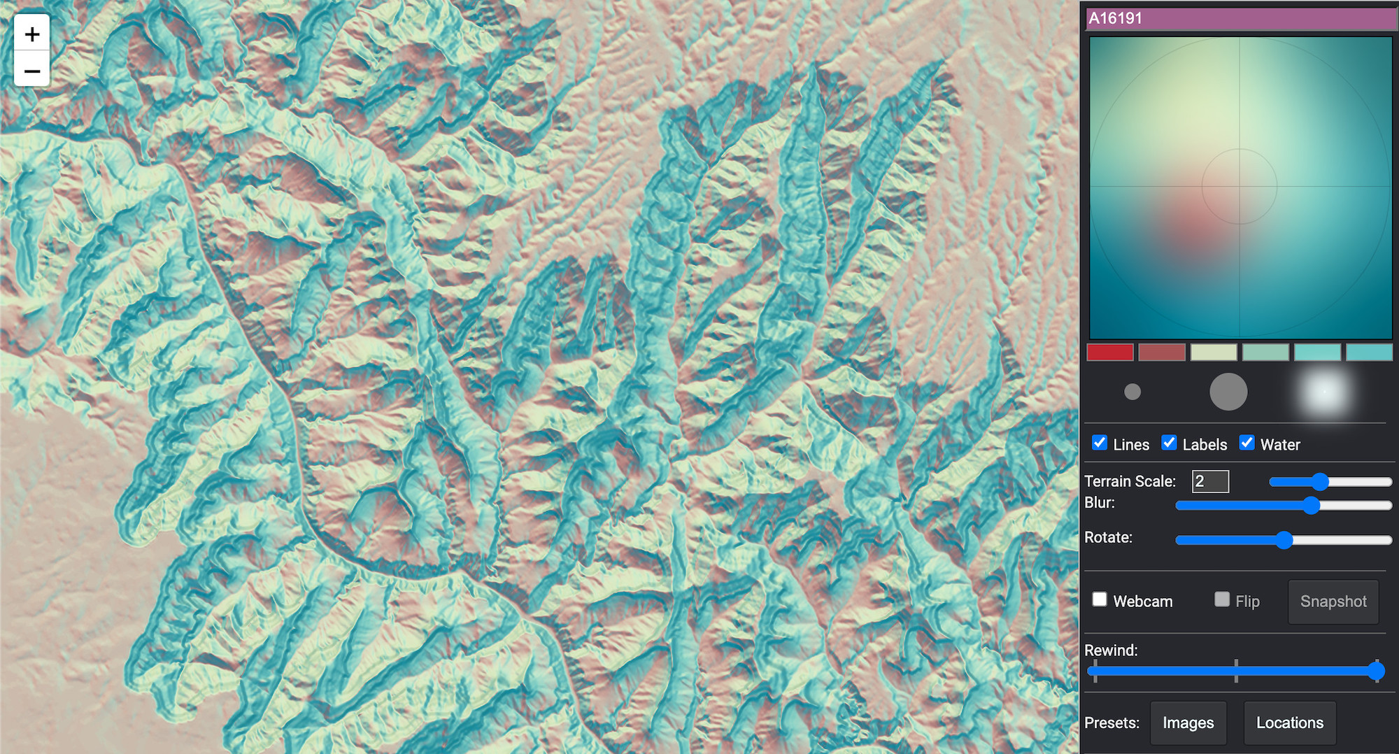 Grand Canyon
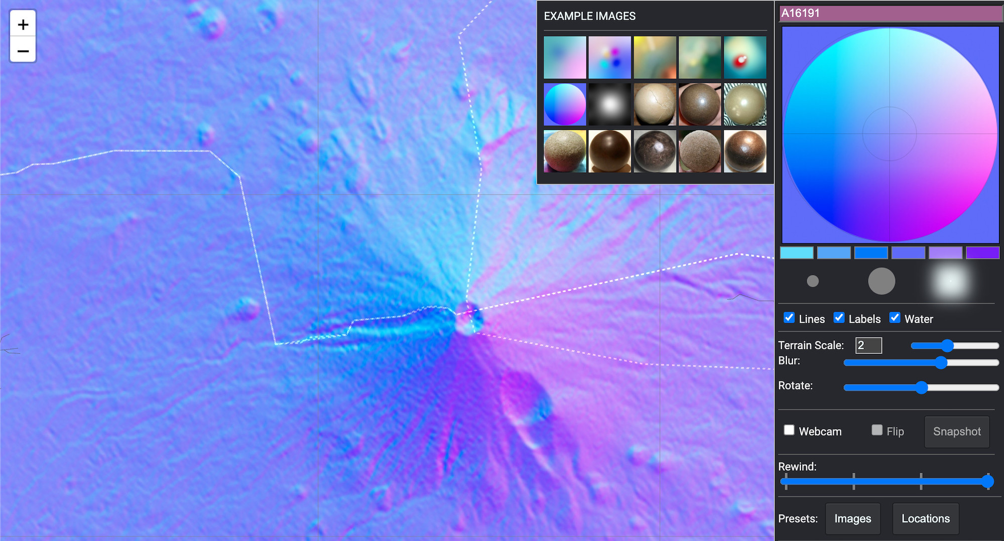
Working with engineering, the graphics team decided to include a version of our terrain data in a form which encodes the angles of topographical slopes. This allows virtual lights to be applied at runtime, client-side.
This design tool makes use of an additional technique I borrowed from 3D VFX work called a spheremap, which simulates global lighting using textures. Spheremaps assign an array of pixel colors (better known as an bitmap) to a corresponding array of geometric angles, such as those encoded in our terrain data product. This can then be used in lighting calculations in place of traditional light sources, effectively painting a piece of 3D geometry with an image.
The interface uses an embedded JavaScript canvas element as a literal canvas with brushes and a color palette, with an interactive terrain map on the side. The spheremap calculations reference this canvas directly in real-time as the user paints, for instant feedback. This tool was used in the creation of maps and map baselayers by the design team, and both the baselayers and the tool were made freely available for public use in open-source mapping projects.
Technology used:
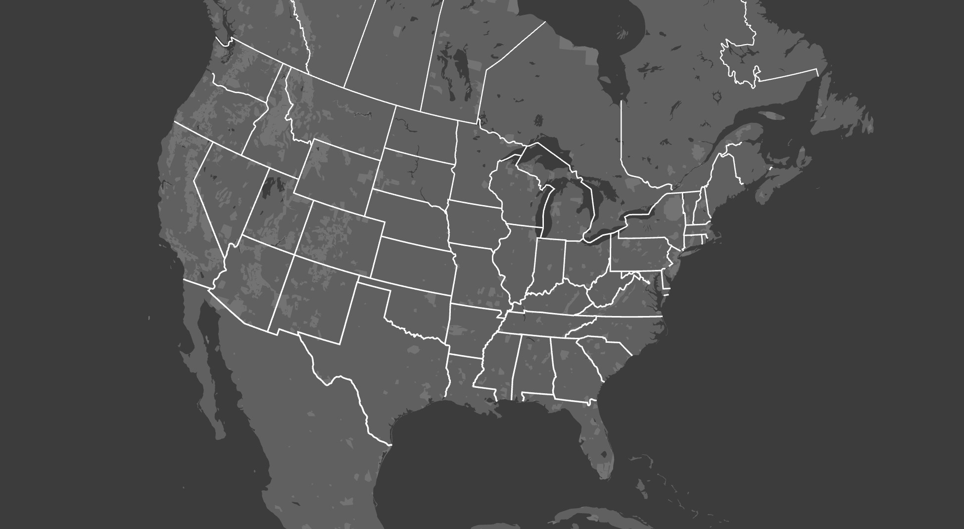
While at Mapzen, I created many prototypes to test the capacity of the codebase and guide further development. One of the most important characteristics of any map is its projection, which is the method the map uses to distort the features of a spherical Earth into a flat plane.
The vast majority of online maps are in the Mercator projection, which has a long history and many flaws. However, its simplicity and ubiquity have ensured a degree of technical lock-in, including its enshrinement into the actual data sources the engineering team created to produce custom maps.
Many other map projections are familiar to us in other contexts, including those known as the conic projections, seen by schoolchildren in the US for decades on classroom wall maps of the United States. However, conic projections are also flexible, and can be adapted to minimize distortion for any point on earth, including the poles.
Could a web map datasource be used to produce such a versatile, non-Mercator web map?
 North American Conic Projection
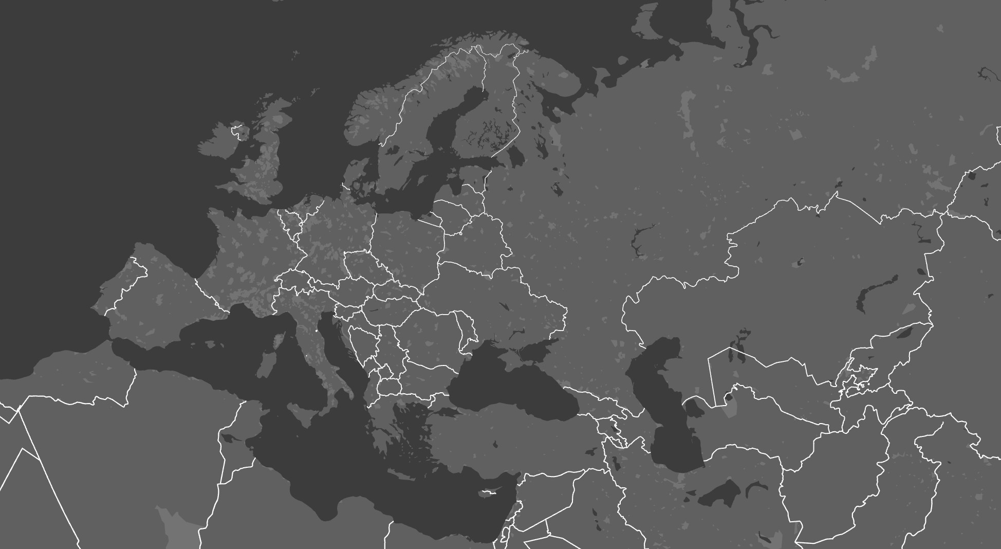 Eurasian Conic Projection
To create this map projection demo, I used the ability of the Tangram mapping library to manipulate map data geometry directly, as though it were an animatable asset in a video game. Using custom vertex shaders, I “unprojected” a set of Mercator-based tiled vector data points to regular latitude and longitude coordinates, and then reprojected them in a conic projection.
As the map moves, the map’s position is fed to a set of variables in the projection, adjusting it to minimize distortion at a given latitude. In this way the demo shows both the capacity of the projection and the unique capabilities of the team’s technical offering, producing maps with less distortion.
Technology used: